

Thought I would share a few things about Google’s Algorithm Update (experts named it ‘mobilegeddon’) which is said to influence search results way more than any other Update (Panda or Penguin). For those who couldn’t stay updated, Mobilegeddon is basically all about Google giving more priority to websites that are easily accessible on smartphones. Search Engine rankings will fluctuate from April 21st favoring websites that are optimized properly for mobile devices. Mobile friendliness of a website will be a ranking signal which will have a great impact on the search traffic and mobile searches in all languages worldwide. I would like to jot down some main points that should be taken into consideration so that we can make sure our websites gain a rank boost, instead of a heavy drop.
Here is an example of a mobile friendly test carried out on www.sweans.com :
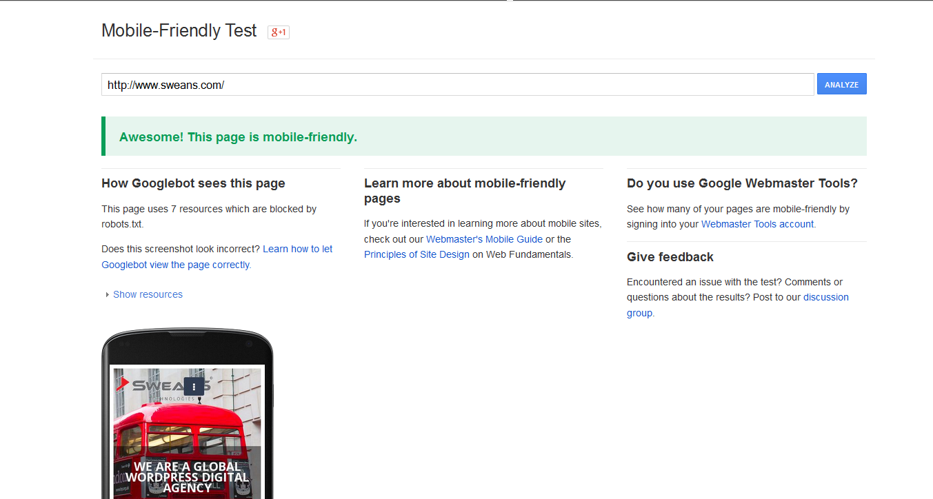
This shows the website of Sweans is entirely mobile friendly and will not face any downtrend in its Google ranking. Google recognizes three different configurations as “mobile friendly”. Move your content to any of the following set-ups and be protected from the change.
1. Responsive design is much desirable as it does not double the copies of the same site and is mainly recommended design pattern by Google. Viewers only have one URL to go to and the website will adapt as they move from phone to tablet to desktop and beyond.
2. A separate mobile website creation was one of the versions mostly utilized in the past for the process of optimization. As this method requires maximum maintenance it is not recommended theses days. In addition, it can be a disruptive experience for someone who accidentally clicks on the mobile link, possibly shared through social or email, while on a desktop computer.
3. A dynamic serving approach keeps the same URL but now the HTML actually changes. This approach uses user- agents to sniff the kind of device a viewer is using.
Responsive design – Why a best choice ?
1.Visitors of the websites love it:
Considering myself as a visitor of the site responsiveness is seamless to me. The URL address and the HTML contents remain the same but it just adapts and gets proportioned.If I email myself a link from my phone and then reopen it on my desktop, it’s going to be a consistent experience either way.
2.Google loves it:
According to Google’s viewpoint responsiveness saves resources when Googlebot crawls a site. There will be no need of crawling multiple sites rather it can go to one place and increase the efficiency. It also helps Google’s algorithms more accurately assign indexing properties to a piece of content without needing to check two places.
3.Website owners and the marketers will love it:
Time required for the maintenance of the responsive site is very less as there are no multiple pages for the same content. There is no requirement of the redirection of users based to other URLs based on their device, which speeds up the load time of the website — and faster sites lead to more conversions.
Common Mistakes to be avoided while optimizing !!!
Google say’s following mistakes should be avoided while optimizing the site for mobile devices and the change in algorithm.
1.Blocked JavaScript, CSS and image files :
Always allow Googlebot access to the JavaScript, CSS, and image files used by your website so that Googlebot can see your website like a common user.
2.Unplayable content :
There are many of the unplayable content when featured on a page of any website can be very frustrating for users. Google recommends using HTML5 standard tags to include videos or animations instead of using a proprietary video player or putting content in unsupported formats.
3.Faulty redirects:
You must redirect mobile users on each desktop URL to the appropriate mobile URL if you have separate mobile URLs.
4.Mobile -only 404s:
Some sites serve content to desktop users accessing a URL but show an error page to mobile users.

5. App download interstitial:
Promotion of the native apps is carried out through the medium of mobile website visitors but if it is not done with care, this can cause indexing issues, and disrupt the visitor’s usage of the site.
6. Irrelevant cross links:
A common error is to have links point to an irrelevant page such as having the mobile pages link to the desktop site’s homepage when a website serves users on separate mobile URLs to have links to the desktop-optimized version, and likewise a link from the desktop page to the mobile page.
7. Slow mobile pages:
Make sure your mobile site loads quickly as visitors can become very frustrated if they have to wait a long time to see your content.
Queries of a website owner !!!
1. What if I’m not ready for a redesign now ?
The answer to this question is that there is no need to fully redesign your website now to comply with Google’s requirements for mobile-friendly sites but you have to just move your existing site, blog or landing pages to a mobile friendly platform.
2. If I do not optimize for mobile now will my site be permanently penalized ?
You will not be permanently penalized but of course you will lose your traffic if optimization is not taken seriously. There are differences in the mobile search volume based on the industries. As per the latest researches carried out it can be definitely said that mobile friendly sites increases the mobile conversion rates and triples the chances of increasing your visitors.
3. What are the other elements to be considered in optimizing website for mobile ?
The loading speed of the site should be faster, the fonts should be big enough, considering the length of the forms on mobile devices.If you have a landing page tool that allows you to swap out forms for people visiting on mobile devices, build shorter forms into your strategy.
Conclusion:
The kind of algorithm change brought by Google will lead to a better impact on the website users as well as the marketers.Website modernization will optimize the way people shop and meet their needs, it will reduce the friction on the website and will finally lead to more conversions and revenue for the company.I hope all this proved to be useful for my viewers and you all will act accordingly to make your website mobile friendly.