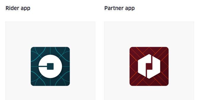
Are you among the millions around the world who are turning and screening their smartphones for the old black and white Uber Icon only to find out whether it’s missing? If you are doing this please don’t waste your time as you are now going to see a geometrical shape – hexagonal if you drive and circular if you are a rider surrounded by a small square. Patterns and the colors will vary from country to country. In china it will be Red, in India it will be turquoise, in United States it will be dark teal. The app will get opened with an elegant, patterned animation which will welcome the users to the new Uber.
Check by yourself? Does it work? Did you like it? The company’s founder and CEO Travis Kalanick is waiting to hear the public opinion about the new logo.
Uber is functioning successfully in 400 cities in 65 countries. This change is more than a corporate rebranding effort. No market driven reasons can be seen for Uber to change the logo. This idea did not come from any of the drivers, customers, brand architects or any others in the marketplace. It came from inside the heads of the CEO Travis Kalanick and his team. Though Kalanick is not a designer, he is an entrepreneur by nature and decided not to entrust the rebranding to anyone else. Branding experts are usually hired for the translation of the corporate values into colors and fonts but Kalanick was against it.
It’s a coming of age tale. Uber attempted this rebranding just to transform its purpose and cement a new reputation. It changed the logo to change the way it perceives itself.
The concept: Atoms and bits gave the team a frame on which to hang the redesign. The old branding materials were entirely nonexistent. The marketers could only use the gray, black and blue colors to put together ads and promotional materials. Team started working on the same with the conceptual framework for building a toolbox of the materials with new colors, photographs and illustrations. They used to carry out the jam sessions with Kalanick and that could last up to four hours.
Different sets of patterns emerged organically and the creative mind behind this was Catherine Ray, a communication designer who was inspired with the small squares on the bathroom tiles. There were varieties of options she affixed for the approval.
The team has taken 18 months to agree on five pillars that could best describe what Uber aspires to be: populist, inspiring, highly evolved, elevated and grounded.